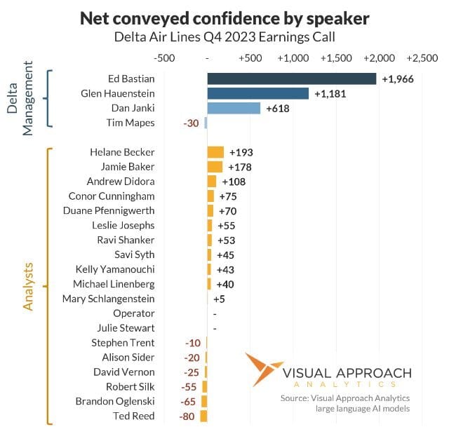
Ed Bastian most contributed to investor confidence in Delta Air Lines during the Q4 2023 earnings call. 1,966 confidence, to be exact.
Let us explain:
Earnings calls have forever fascinated us. Yes, the companies’ earnings can be measured to determine the quarter’s performance, but what about the conference call itself?
How well did the earnings call reflect on the company’s performance? Better yet, how well did each conference call speaker reflect on the company’s performance?
Does the tone of the prepared remarks reflect differently on the past quarter than the question and answer period?
Which analysts pose engaging questions? How well are they answered?
Once upon a time, we would track stock prices by the second while earnings calls were taking place. It was marvelous. You could see the immediate effects of what was said on the confidence level of the market. Positive comments: stock go up. Negative comments, stock go down.
Only, it came with a big problem: Most earnings calls take place before or after the market opens.
So, we did what we do anytime we have a cool idea without a way to pull it off. We built a new model.
If we have prior earnings calls that took place while the stock market was open, we have an objective way to measure those calls. We also have a way to build an LLM to correlate the actual words spoken to that same market confidence without the markets being open.
(LLM = Large Language Model. It means AI, but not the marketing version of AI you hear tossed around willy-nilly. These models are built using transformers to understand the full context of a sentence and paragraph rather than relying on individual words. If you really want to know more, we invite you to check out Hugging Face. You read that right. “Hugging” then “Face”. The AI world is strange.
Still confused? We used AI. We’re magic. That sums it up.)
How does the chart work?
The model measures the comments made by each speaker as it relates to company performance. Positive comments return positive results. Negative comments return negative results.
For instance, let’s look at Ed Bastian:
Each gray bar represents a time when Ed was speaking. The first bar is the prepared remarks. Up and to the right, just like prepared remarks are supposed to do. This is a trend we see on most calls. The CEO delivers the good news, and then the other members of the call go through the numbers. Sometimes, they differ; Sometimes, they differ greatly.
But let’s take a look closer at what happens a few analysts into the question-and-answer period:
Jamie Baker of J.P. Morgan asks a question. The question itself is not negative, in fact it is rather supportive of the company’s performance leading in a bump. But, the question asks whether the financial targets were entirely within the company’s control.
Ed goes on to list all the terrible things that could make them miss their goal of $7 per share. Things go south a bit.
But then Conor Cunningham (apologies to Conor for the misspelling of his name in the chart) asks his question about regional expectations. A benign question that reads appropriately neutral.
This time, though, Ed appears to be aware of the dip in in the tone of the call and works to balance it with a string of positive comments. Things bounce back.
We can judge how much each speaker contributed to the modeled market confidence in the call. Ed tops the charts. But this is to be expected. Ed talked the most. But, Glen Hauensten and Dan Janki also had positive results.
One might be tempted to say Tim Mapes was a net negative and shouldn’t be on the call, but that’s not what the model shows. In fact, Tim spoke very little and only during the question-and-answer. However, showing his very small results highlights an area we are still fine-tuning in the model. At the very end of the call, Tim Mapes says, “That will wrap up the call.” A neutral comment with a slight positive confidence. But then he goes on to say to the operator, “If you want to close it up.”
Think about this from AI perspective. It’s supposed to read what is said in the context of company performance, and a company leader just said, “Close it up”! Sure sounds negative to me, so Tim gets a negative score (an incorrectly attributed negative score, admittedly). It’s small, and the blip is meaningless, but it’s there.
The model is wonderful at measuring words in the context of company performance. It’s great at separating out the operators. But get somebody from the company who makes a procedural comment?
We’re still fine-tuning.
Hawaiian’s Q3 2023 earnings call

Things aren’t always rosy. Take Hawaiian’s Q3 2023 earnings call, for example. The fires on Maui had just ravaged Lahaina. Bad things. These reflected negatively on Hawaiian Airlines.
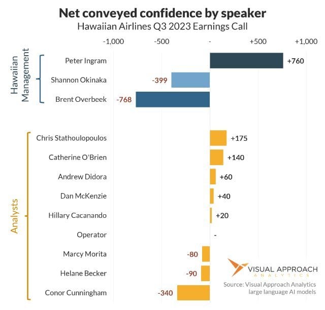
It’s not Peter Ingram’s fault the confidence dropped. Negative things happened. He disclosed those negative things. The drop reflects the perceived market confidence of the company, not the individual. Large drops in travel due to a natural disaster reads appropriately negative.
What we found so fascinating with this call is the overall negative direction of the prepared remarks with some recovery during the question-and-answer. Things were bad. They led with the bad news. But then the analysts started asking questions, and the perception was things were not quite that bad. Considering the circumstances, it was a fairly successful call.
But take a look at the second half of Peter’s initial prepared remarks. After leading with the challenges the islands were facing, he then goes on to say, “I'll now touch on a few highlights of our commercial performance that Brent will address in more detail.”
A few highlights, indeed. Peter pulls out of the dive, delivering the good news that will be discussed with numbers immediately after.
The call switches to Brent Overbeek to talk numbers. Those numbers? Not so great. Shannon Okinaka then talks about financials. Again, not so great. Not because they’re terrible speakers but because the numbers were negative.
There are two other things you should probably know about this model. First, it comes in collaboration with the genius mind of Kuldeep Malhotra of iQuest Solutions. Countless hours have been spent with Kuldeep over homemade chai teas building, testing, and visualizing this model. He makes wonderful chai.
Second, this model isn’t fine-tuned only for airlines. It can be used for any earnings call. This is the type of work we do with our clients, even the ones not in aviation.
Of course, no ultra-long analysis would be complete without an honest advertisement. This type of modeling is exactly what we do. If your organization can benefit from this type of modeling, let’s talk. Most of our time is spent using the same types of tools to monitor the commercial aircraft space, but as it turns out, we do things for money. :)
10/20-year Aircraft Forecast preview - shortages and oversupplies
COVID changed a few things. For instance, when was the supply chain mentioned in a 20-year forecast, let alone set as a restricting factor?
We’ve thrown out how we used to do long-term fleet forecasting from 2019 and are building a new fleet forecast from scratch. This one considers many of the new realities, including that supply will not always match demand.
This forecast is broken down by year, aircraft type, and region to offer a detailed look into what is expected to happen in which aircraft segment in which region. We are already working with clients on sensitivities. What if a downturn arrives in 2028? What if C919 production can ramp up? What if it can’t? What if the 737-10 is another year late or the 777X early?
The forecast is built into a 40+ page data-driven report and an Excel download of the model, both available to our full Visual Approach Research subscribers.
Expect to hear more next week. In the meantime, here is a sneak peek of a continuing trend expected to affect the global supply and demand for aircraft in the coming decades:

You should do a chart on…

AI-generated chart that shows… nothing
We like to create valuable charts. But, it’s not easy coming up with new ideas amid the endless hours delivering data-driven edge to our customers. In our quest to provide a valuable weekly newsletter we can keep guessing what you find most valuable, or you could just tell us.
If you have an idea for data visualization, reply to this email and let us know what analysis you’d find most valuable. We’d love to hear from you and will happily name-drop.
ACCESS OUR DATA AND ANALYSIS
We provide bespoke analysis to investors, lessors, and airlines looking for an edge in the market.
Our approach to analysis is data-driven and contrarian, seeking perspectives to lead the market, question consensus, and find emerging trends.
If a whole new approach to analysis could provide value to your organization, let's chat.
If you were forwarded this email, score!
As valuable as it is, don't worry; it's entirely free. If you would like to receive analyses like this regularly, subscribe below.
Then...
You can pay it forward by sending it to your colleagues. They gain valuable insights, and you get credit for finding new ideas!
Win-win!
Contact us
Have a question? Want to showcase your organization in a sponsored analysis? Reach out.
It’s easy. Just reply to this email.
Or, if you prefer the old way of clicking a link, we can help with the hard part: contact


