Data doesn’t lie — except when it does.
Boeing has had a rough year half-decade.
Between the two 737 MAX crashes and a recent door plug that became — less-than-plugged — questions have risen regarding the safety of Boeing aircraft.
A widely circulated chart by the popular data visualization team Visual Capitalist shows clear data that Boeing aircraft are not as safe as Airbus.
Or did it? (Spoiler alert: It didn’t)
Many of you may have seen the chart and thought, “Wait a minute. That doesn’t look right.” Just as many probably saw my near-obsession with setting the record straight whenever I saw the misleading chart shared online.
So what exactly happened?
The analyst who created the misleading chart used the NTSB incident report database to compare the number of incidents by the aircraft manufacturer. They sorted by any aircraft with “Boeing” listed as the manufacturer, compared those that said “Airbus” and fired off a chart.
The data was sourced, and indeed, we could duplicate the results. That’s good.
But this is where raw data gives way to context. Every incident involving a Boeing aircraft was compared with every incident involving an Airbus aircraft. Sounds straightforward, especially if you’re not in aviation. What could go wrong?
What went wrong:
The analysis falls apart very quickly. After duplicating the results, here are the areas for context that were overlooked.
1. Boeing aircraft from World War II were included
Boeing is an old manufacturer — 108 years, to be exact. The NTSB lists the manufacturer in the reports, not the era they were built. Indeed, looking through the data, we quickly found 61 instances of Boeing Stearman and Boeing B-17 incidents included.
What are the Stearman and B-17, you ask?

Boeing B-17 - 1935-1945 photo credit: Airwolfhound
Would the average person seeing a chart showing Boeing as less safe than Airbus consider these aircraft included, stunningly beautiful as they are?
2. Boeing aircraft built before Airbus existed are included
We also found several ancient Boeing 707 and 727 aircraft built before Airbus came into existence in 1972 in the data. We pulled those out, but fear not, for they would have been extracted in later filters, anyway.
3. The NTSB data does not include all Airbus data
This is where things went off the rails (besides confusing warbirds for modern commercial aircraft, anyway). The NTSB data reflects whatever has been reported. So why would Boeing data be reported differently than Airbus data?
Boeing is a U.S. manufacturer, and the NTSB is far more likely to be involved in foreign investigations of Boeing aircraft than Airbus. This from the NTSB:
The NTSB aviation accident database contains civil aviation accidents and selected incidents that occurred from 1962 to present within the United States, its territories and possessions, and in international waters. Foreign investigations in which the NTSB participated as an accredited representative will also be listed.
Indeed, when we went through the database record by record, we found far more Boeing reports for minor incidents than for Airbus. This point is critical and invalidates the chart as presented. There is no comparison to be made with this data included.
However, to continue the analysis, we distilled the data only to where we knew both Boeing and Airbus incidents would be reliably reported. Since the NTSB is a U.S. entity, we can only compare those incidents that take place on flights touching the U.S.
4. Cargo and charter aircraft flying are included
Since we cannot accurately estimate the amount of charter and cargo flights to compare incident rates, they were pulled from the data. This impacted only Boeing aircraft since the cargo and charter fleet are dominated by Boeing-built equipment. Regardless, it appears this rate was lower than average and would have reduced Boeing’s rate of incidents had it been included.
Here’s the breakdown of what was duplicated from the Visual Capitalist chart after removing the invalid reports:

The number of Boeing incidents dropped from 970 to 165. However, applying the same filters to the Airbus data also reduced the number of valid reports from 264 to 84.
Astute mathematicians may have noticed that the number of Boeing incidents is still twice the number involving Airbus aircraft. Is Boeing half as safe as Airbus?
Still, no. Boeing is achieving twice the amount of incidents with twice the number of departures.

Far more Boeing aircraft grace the skies over the United States than Airbus in the years compared The difference is shrinking, but Boeing has had roughly twice the number of departures as Airbus over the past decade.
Cool. Discrepancy solved, right?
Not quite. There are some other areas of context in this data to which we must draw our attention:
The NTSB database includes all reported accidents and incidents. And we mean ALL of them.
What determines whether a report exists in the NTSB’s database? Whether or not a report was filed. It doesn’t really matter what’s in the report.
Take the probable cause for the tragic Southwest flight 1380, for instance:
“A low-cycle fatigue crack in the dovetail of fan blade No. 23, which resulted in the fan blade separating in flight and impacting the fan case. This impact caused the fan blade to fracture into fragments that traveled farther than expected into the inlet, which compromised the structural integrity of the inlet and led to the in-flight separation of inlet components. A portion of the inlet struck the fuselage and created a hole, causing the cabin to depressurize.”
Now compare that with the probable cause of another NTSB report filed for a different Southwest flight:
“a passenger bumping into a flight attendant who was holding a hot liquid.”
The two incidents cannot be compared.
We went record by record to determine the probable cause for each incident reported. Here’s what we found:


There are a lot of reasons to file an NTSB report that have nothing to do with the aircraft. In fact, the most common reason was inadvertent turbulence.
We applied liberal groupings to determine which incidents could be attributed in any way to the aircraft. The obvious candidates emerge: engine failures, electrical system failures, and manufacturing defects (reference the Alaska Airlines door plug. We took the liberty of changing the probable cause from “unknown” to “manufacturing error”). However, we also included some less direct factors that are aircraft-related, including tail strikes and maintenance errors.
While tail strikes are likely better described as human error or environmental factors, they can also be a function of the aircraft design and how easy it is to strike the tail, similarly with maintenance errors. Technically human error, it could be reasoned that the aircraft had an indirect role in the difficulty in preventing maintenance errors.
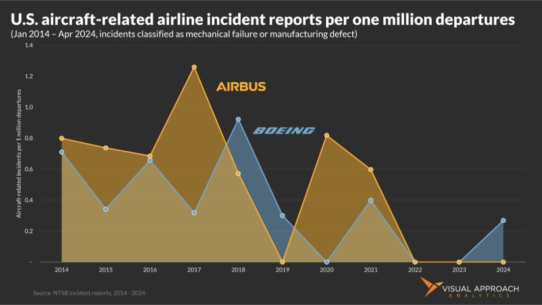
The result of all aircraft-related incidents appropriately aggregated on a per-departure basis (per one million departures was used):

We would label this chart as “boring.” There is no correlation. Boeing and Airbus have very similar rates of aircraft-related incidents, and they are both very low.
If we look at only the direct aircraft-related incidents without the liberal definition of tail strike or maintenance error, we get a very similar chart:

Wait, does this mean Airbus aircraft are less safe than Boeing?
No. It doesn’t mean that, either. The NTSB data shows that both Boeing and Airbus have remarkably similar safety records - as well as remarkably low incident rates. Flying an Airbus or Boeing aircraft is extremely safe.
So what?
Why all the attention on an incorrect chart?
Look, we’re not in the business of correcting people… it pays horribly. But, very few people outside the industry would stop to consider how a published chart on aircraft safety was incorrect. This chart not only spreads disinformation, it spreads fear, even if inadvertently.
Conversely, The Seattle Times did an admirable job of providing more context to the NTSB numbers in a recent article. You’ll notice very similar-looking charts to ours, but with one key difference: aggregate numbers of incidents are still used, suggesting Boeing’s rate is higher while providing the context of greater Boeing departures separately in the text.
Even though the article aimed to quell the same misinformation, the charts still show elevated Boeing incidents when, in fact, the rate is the same. A seemingly small difference to us, but consider this article was sent to me by a concerned family member who used it to “prove” that Boeing aircraft were unsafe. The attempt by the Seattle Times to use good data to ease irrational fears actually added to the hysteria in this anecdote.
Consider this: How many people do you think would have read this far down the newsletter to find this text with so many pictures available? Good for you, but you're in the minority.
When it comes to public perception of safety, details matter.
A note on Southwest Airlines
We used several NTSB reports from Southwest as examples above. That wasn’t a coincidence. Southwest Airlines has been the top reporter of NTSB incident reports for all carriers over the past decade.
But good data analysts ask why.
It could be that Southwest Airlines has more incidents and is a less safe airline. It could be, but it isn’t.
Going line-by-line through all reports produced a clear trend: Southwest reports all incidents to the NTSB, seemingly applying a lower threshold. These incidents range from spilling hot water to passengers tripping in the aisle to broken tugs and rolling baggage carts.
This highlights another danger of simply using the number of reports filed as an indication of aircraft safety: not all incidents are the same.
Concerning Southwest Airlines, we find the elevated number of incident reports stems from a very strong safety culture, not one of reduced safety. In this case, more incident reports are an indication of increased safety.
And THAT is how the same data can show very different stories.
Stay curious.

Research published this week
We have been in a research publishing frenzy the past week. Here are some of the analyses you may have missed if you’re not a subscriber to Visual Approach Research:
You should do a chart on…

AI-generated chart that shows… nothing
We like to create valuable charts. But, it’s not easy coming up with new ideas amid the endless hours delivering data-driven edge to our customers. In our quest to provide a valuable weekly newsletter we can keep guessing what you find most valuable, or you could just tell us.
If you have an idea for data visualization, reply to this email and let us know what analysis you’d find most valuable. We’d love to hear from you and will happily name-drop.
ACCESS OUR DATA AND ANALYSIS
We provide bespoke analysis to investors, lessors, and airlines looking for an edge in the market.
Our approach to analysis is data-driven and contrarian, seeking perspectives to lead the market, question consensus, and find emerging trends.
If a whole new approach to analysis could provide value to your organization, let's chat.
If you were forwarded this email, score!
As valuable as it is, don't worry; it's entirely free. If you would like to receive analyses like this regularly, subscribe below.
Then...
You can pay it forward by sending it to your colleagues. They gain valuable insights, and you get credit for finding new ideas!
Win-win!
Contact us
Have a question? Want to showcase your organization in a sponsored analysis? Reach out.
It’s easy. Just reply to this email.
Or, if you prefer the old way of clicking a link, we can help with the hard part: contact


